Selected work

Six concept case studies.

Self-initiated concept projects that show how we approach strategy, identity, packaging and digital design. The brands are fictional and created for this portfolio; there are no real clients or results claimed here.

Filter by

Showing all 6 projects

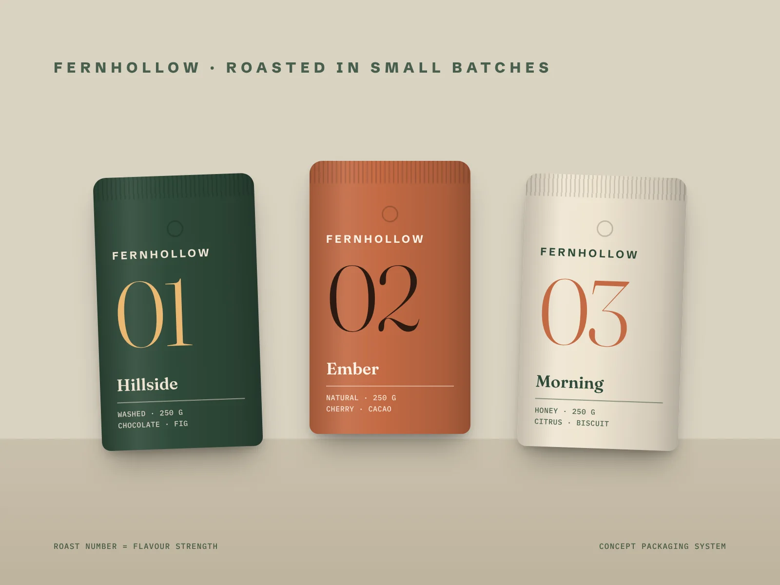
Concept packaging: three Fernhollow coffee pouches in green, terracotta and cream, numbered 01, 02 and 03

Concept project

Packaging

Branding

Fernhollow Coffee

A small-batch roaster needs bags that look like a range, not a jumble. We built a pouch system around one big roast number, a calm serif and a colour per roast, so the shelf reads at a glance and new coffees drop straight into the same template.

Industry

Speciality coffee roaster

Deliverables

Wordmark, packaging system, label templates

Concept identity: Kestrel Cycle Works circular K sign, sticker and business cards in navy and yellow

Concept project

Branding

Kestrel Cycle Works

A neighbourhood workshop wants to look as trustworthy as a big chain without losing its character. A circular K monogram, heavy condensed lettering and a navy and yellow palette give it a sign that reads from across the street and a kit that is cheap to print.

Industry

Bike repair workshop

Deliverables

Logo and monogram, shop signage, business cards, stickers

Concept app design: two Tidewell phone screens showing savings pots and an onboarding screen, with the wave app icon

Concept project

Digital

Branding

Tidewell

An early-stage savings app needs to feel calm, not clever. A two-line wave mark, generous spacing and colour-coded savings pots keep each screen to one clear action, and the onboarding explains the product in three short screens.

Industry

Savings app (fintech)

Deliverables

App icon, interface design, onboarding screens

Concept packaging: Orla & Finch amber skincare bottles with cream labels next to a carton with a botanical line drawing

Concept project

Packaging

Orla & Finch

A natural skincare start-up wants packaging that feels considered without looking expensive to make. Amber glass, an uncoated cream label, a single-weight line illustration and clear ingredient panels keep the range consistent from the 15 ml serum to the 30 ml oil.

Industry

Natural skincare

Deliverables

Bottle labels, cartons, line illustration

Concept book covers: four Brightmoor Press covers with large serif titles in red, black, green and yellow

Concept project

Branding

Brightmoor Press

An independent publisher needs every cover to look different but still belong on the same shelf. We set a strict grid, a high-contrast serif and a one-colour rule, so designers can create a new cover in an afternoon and the list still looks like one family.

Industry

Independent publisher

Deliverables

Wordmark, book cover system, type guidelines

Concept wayfinding: Quarry Climbing black poster and bright direction signs for bouldering, lockers and café

Concept project

Branding

Digital

Quarry Climbing

A new climbing centre needs signs people can read mid-session. Condensed capitals, big arrows and the four hold colours as a coding system run from the posters to the wayfinding and the website graphics, so the whole building speaks the same language.

Industry

Indoor climbing centre

Deliverables

Identity, wayfinding signs, poster and web graphics

About these case studies

Every project on this page is a concept created by the studio to show our process. Names, products and people are invented, and any resemblance to a real business is unintended. Photography-style images are digital mockups made in-house.

Like what you see? Let’s make yours.

Tell us what you are building. We reply to every enquiry within two working days.